Start With the Right Photograph
The quality of an extracted palette depends heavily on the photograph you choose. Start with an image that has clear areas of color, useful contrast, and a subject related to your project. A room with painted walls, furniture, and natural light will usually produce more practical swatches than a busy snapshot with dozens of tiny details.
Pay attention to lighting before you upload. Strong color casts, harsh filters, or deep shadows can create shades that look attractive in the image but fail in other settings. If possible, use an original, unedited photograph with reasonable exposure. Also consider the mood you want to preserve: a calm landscape, a bright product photo, and a muted portrait will each lead to very different palettes. Crop out distracting edges or unrelated objects so the tool focuses on the colors that matter.
Choose an Online Palette Generator
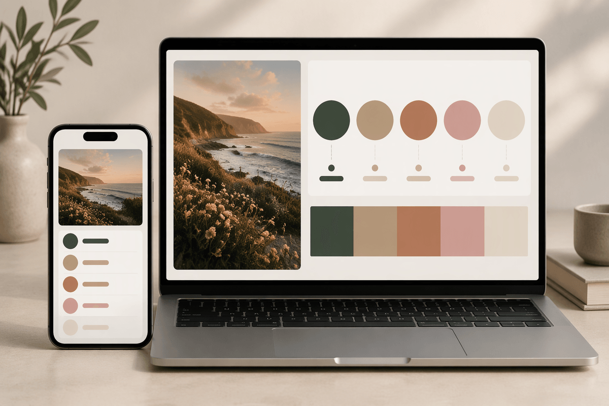
Choose a browser-based palette generator that lets you upload an image directly and export or copy the resulting color codes. Many tools offer similar basic functions, but useful differences appear in the details. Look for controls that let you change the number of swatches, view HEX or RGB values, and select colors manually when the automatic choices miss an important area. A clean interface matters too, especially if you are working from a phone or moving quickly between design tasks.
Start with a tool that produces a small, readable palette rather than dozens of nearly identical shades. Five colors are often enough for an initial system: a dominant color, one or two supporting tones, an accent, and a light or dark neutral. Some generators emphasize the most frequent colors, while others look for visual contrast. Neither approach is always better. A frequency-based result may reflect a large sky or wall, whereas a contrast-based result may better capture the image’s character. Treat the first output as a starting point, not a finished decision, and check whether the tool allows you to regenerate or adjust the selections.
Upload the Image and Extract Colors
Open the generator’s upload control and choose the original photograph from your device. Most tools accept common formats such as JPG or PNG, but very large files may take longer to process or fail to upload. If that happens, make a copy at a smaller size rather than repeatedly uploading the full-resolution file. After the image appears, give the tool a moment to analyze it. The first palette usually reflects the strongest visual areas, not necessarily the colors you consider most important.
Review each swatch against the photograph instead of accepting the result automatically. Check whether the palette includes meaningful colors from the subject, background, and overall mood, or whether it is dominated by a large expanse such as sky, grass, or a plain wall. If the tool offers a color-count setting, begin with five to eight swatches. Increase the number only when the image contains distinct colors that the first result misses. Many generators also let you click directly on the image to sample a specific area. Use that option for an important detail, such as a product label, fabric tone, or small accent, then compare the manually selected color with the automatically extracted set.
Refine Colors That Do Not Feel Right
An automatically selected swatch can be accurate and still feel wrong for the project. Compare it with the photograph at full size, then ask what is causing the problem. A muddy brown may come from a shadow, while an overly bright blue may reflect a small highlight rather than the image’s main mood. If the tool allows direct sampling, replace that swatch by clicking a cleaner area nearby. You can also adjust the hue, saturation, or brightness slightly, but keep the change close enough to the photograph that the palette still feels connected to it.
Look for balance as you refine the set. If several colors are nearly identical, keep the one that has the clearest role and use the open slot for a lighter, darker, or more contrasting tone. Remove colors created by accidental glare, compression, or background clutter. Avoid correcting every color toward personal preference; a palette that is too polished may lose the photograph’s character. One practical limitation is screen variation: a color can appear different on a phone, laptop, or printed page. Make small adjustments first, then test the palette in a simple layout before deciding it is finished.
Turn Swatches Into a Usable Color System
Once the swatches feel appropriate, give each color a job instead of treating them as equal options. Choose the most visually dominant shade as the primary color, then assign a supporting color for secondary areas such as panels, headings, or background elements. Reserve the strongest contrast for accents, buttons, calls to action, or small details that need attention. A pale or dark neutral can provide breathing room and make the more distinctive colors easier to use.
Test the system in a simple layout rather than viewing the swatches in isolation. Create a sample card, social post, presentation slide, or mood board using the primary color, supporting tone, accent, and neutral. Notice whether the colors compete, disappear, or create too much visual weight on one side. You may need lighter and darker variations of the same swatch for text, borders, or backgrounds. Keep those variations controlled; adding too many can make the palette difficult to remember and apply consistently. The goal is not to preserve every extracted color, but to create a small set with clear roles that can guide real design decisions.
Check Codes, Contrast, and Real-World Results
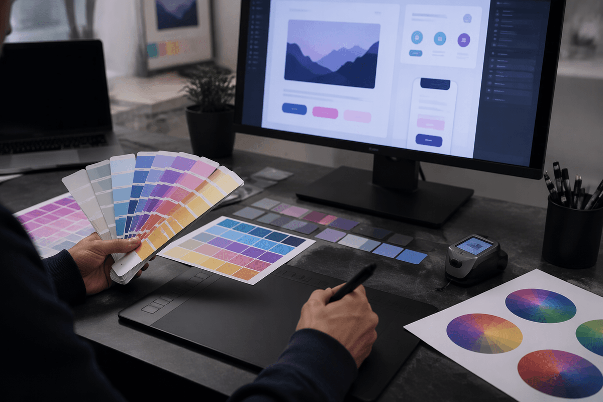
Before applying the palette, check the code for every swatch and record it in a consistent format. HEX is convenient for websites and many design tools, while RGB is useful for digital editing and CSS. If the generator provides HSL or other values, keep them only when your workflow requires them. Copy each code carefully, especially when similar shades appear side by side, and label colors by their intended role rather than by vague names such as “blue” or “green.”
Test the palette with actual content, including headings, body text, buttons, icons, and large background areas. A color that looks balanced in a row of swatches may become unreadable when used behind small text. Darken or lighten a supporting color when necessary, and avoid using a vivid accent for long passages or large surfaces. Check the result on more than one screen if possible, then print a small sample when the project will appear on paper. Printing can reduce saturation and reveal weak contrast that a bright display hides. These checks may require a few extra adjustments, but they prevent a palette that looks convincing in the generator from failing in the finished design.
Save the Palette for Future Projects
Once the palette works in a real layout, save it in a form you can reuse. Record each color’s HEX code, role, and a short descriptive name in a notes file, spreadsheet, or design library. Include the source photograph and the date so you can remember the palette’s visual context later. If the project has light and dark variations, group them clearly instead of mixing them with the core swatches.
Export a small reference image or screenshot as well. Codes are essential, but a visual reference makes the palette easier to recognize when you return to it months later. Keep the original, unedited palette alongside any project-specific adjustments. That preserves the connection to the photograph while allowing future work to adapt the colors for different screens, formats, and contrast needs.