What Makes a Canva Design Look Professional?
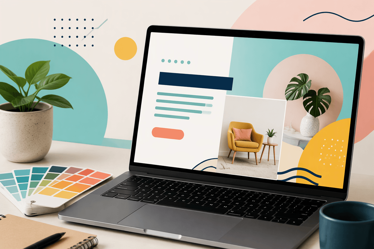
A professional Canva design is not necessarily the most colorful or detailed one. It usually feels clear, balanced, and intentional. The main message is easy to find, supporting elements do not compete for attention, and the layout gives each part enough breathing room. Consistent fonts, a controlled color palette, and high-quality images also help the design feel connected rather than assembled at random.
Small details often separate a polished graphic from an unfinished one. Text that is slightly misaligned, crowded margins, inconsistent spacing, or stretched images can make viewers notice the design instead of the message. Canva makes it easy to add more elements, but restraint is often the better choice. A strong design guides the viewer toward one clear action or idea, even when it is created quickly and without formal design training.
Start With the Right Template and Format
Before changing colors or adding graphics, choose a template that matches the job. A presentation slide, Instagram post, flyer, worksheet, and email header each need a different structure because people view them at different sizes and distances. Starting with the wrong format often creates problems later: text becomes too small, important details get cropped, or the layout feels crowded when adapted to another platform.
Look for a template whose structure already resembles your intended message. If you need to announce an event, choose a layout with a clear headline, date, and call to action rather than forcing those elements into a decorative design. Replace the sample content early and check whether your real wording fits comfortably. Templates are starting points, not rules, so remove sections you do not need instead of shrinking everything to make it fit. It is also worth checking the final viewing context on a phone or printed page, since a design that looks balanced on a large monitor may become difficult to read at its actual size.
Build a Clear Visual Hierarchy
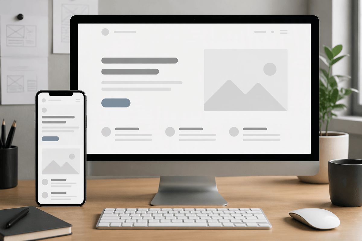
When someone sees your design, they should know what to read first, second, and third without having to figure it out. Start by identifying one main message, such as a sale announcement, event title, or lesson objective. Make that element the most noticeable through size, weight, contrast, or placement. Supporting details should be smaller and quieter, while the call to action should remain easy to find without competing with the headline.
Canva makes hierarchy easier when you create clear levels instead of styling every item equally. Use a large headline, a medium subheading, and smaller body text. Keep related information close together, then leave extra space between separate groups. Alignment also creates order: lining text and images along the same edges usually looks more intentional than placing each item wherever there is room. If everything is bold, brightly colored, or oversized, nothing feels important. A practical limitation is that hierarchy depends on viewing size; text that looks balanced on a laptop may become unreadable on a phone. Preview the design at its real size and simplify anything that loses clarity.
Use Fewer Fonts and Stronger Color Choices
Once the hierarchy is clear, keep the design from becoming noisy by limiting your font choices. Two fonts are usually enough: one for headings and one for supporting text. Choose typefaces with noticeably different roles, such as a bold sans serif for the headline and a simpler version for body copy. Avoid using several decorative fonts just because they are available in Canva. They can make a flyer, post, or worksheet feel inconsistent, especially when viewed on a small screen. Use bold, size, and spacing to create variation before adding another typeface.
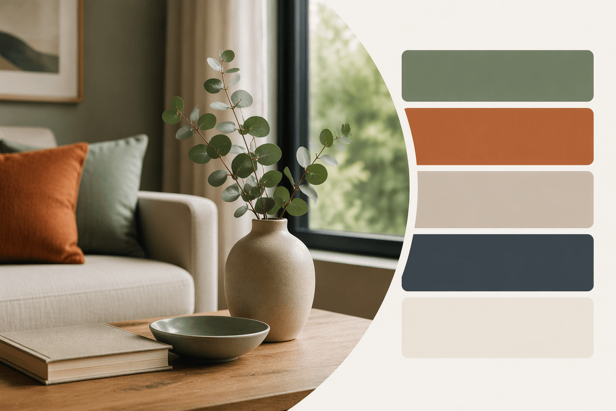
Color works best when it has a job. Start with one main color, one supporting color, and a neutral such as white, cream, gray, or black. Use the strongest color for emphasis, not for every element. A bright button or keyword stands out because the surrounding design is quieter. Check contrast between text and its background, particularly for smaller type. Some attractive color combinations become difficult to read in print or on older screens. If you create content regularly, save a small palette in Canva and reuse it across related designs. Consistency reduces decision-making and makes your materials look connected.
Improve Images Without Overediting
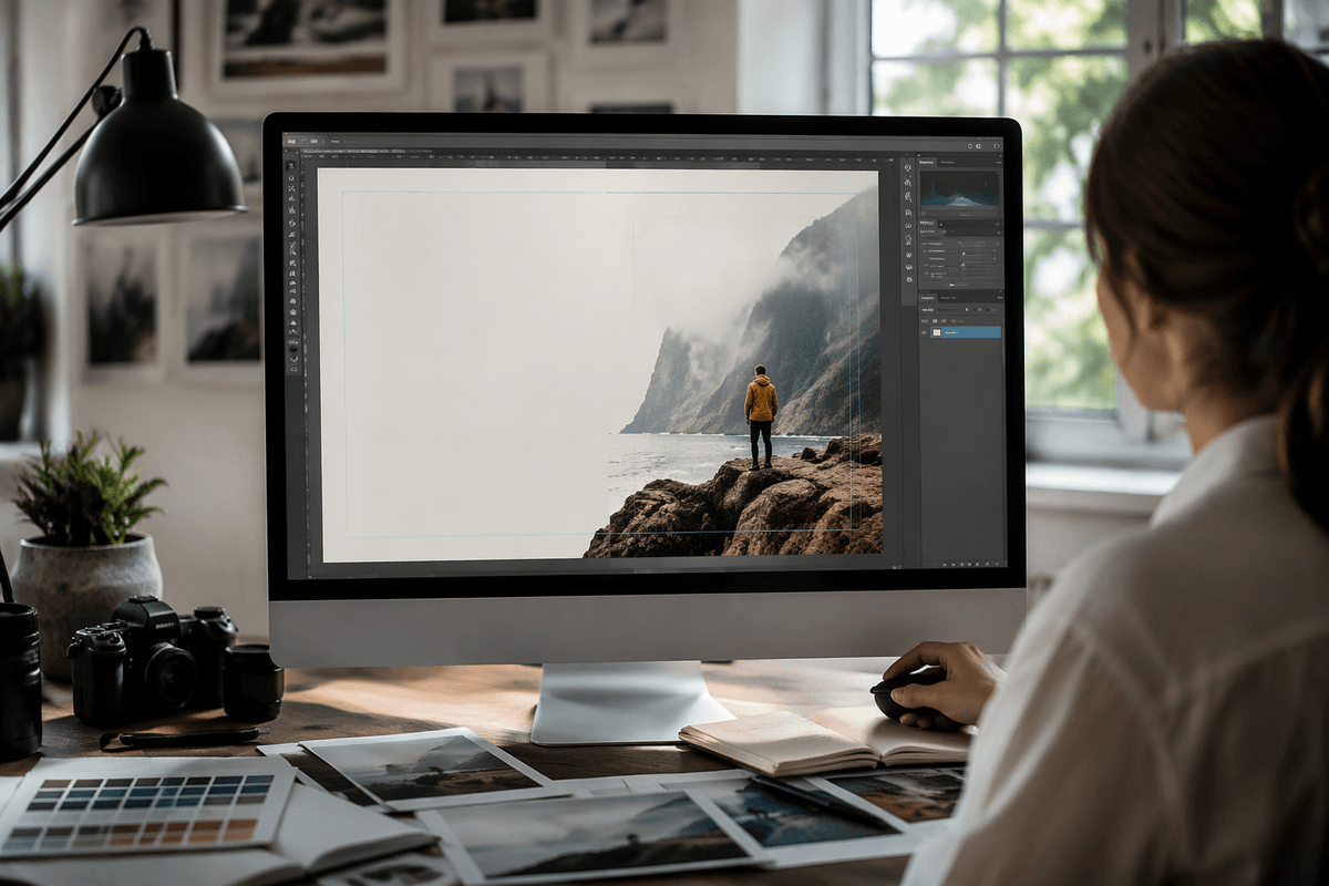
A strong image can make a Canva design feel finished, but the wrong image can create problems that filters cannot solve. Choose photos or illustrations that match the message, audience, and tone. Look for clear subjects, useful empty space, and enough resolution for the final format. A busy background may compete with text, while a tightly cropped image can leave no room for a headline. Before editing, try repositioning or cropping the image so the main subject supports the layout rather than simply filling an empty box.
Keep adjustments restrained. Small changes to brightness, contrast, saturation, and sharpness can improve an image, but heavy filters often create unnatural skin tones, harsh colors, or a mismatched look across a set of graphics. Use the same editing approach for related images so they feel consistent. Check the design on both a bright and dim screen, since shadows and low contrast may hide important details. Canva’s stock images can also look familiar or overused, so combine them with original photos, simple illustrations, or brand-specific details when possible. The goal is not to make every image dramatic; it is to make each one clear, relevant, and easy to read alongside the rest of the design.
Polish the Details Before You Export
Before exporting, inspect the design at the size people will actually see it. Zoom out to check the overall balance, then zoom in to catch uneven spacing, misaligned edges, stray elements, and text that sits too close to the margin. Make sure headings, logos, icons, and images line up consistently. A design can feel unpolished when one item is only slightly off, even if the difference is hard to identify at first.
Read every word slowly, including dates, prices, names, and calls to action. Canva will not catch a missing word or an outdated detail. Check that buttons and instructions are clear, links or contact information are accurate, and no important text is hidden behind an image. Then preview the file in its final setting, such as a phone screen, printed page, or presentation slide. Choose the export format carefully: PNG works well for many digital graphics, while PDF is usually more practical for documents or printing. Exporting a high-quality file can increase its size, so balance sharpness with upload limits and loading speed. Keep an editable Canva version so corrections do not require rebuilding the design.
A Simple Canva Workflow You Can Repeat
When you create designs regularly, use the same basic order each time: confirm the format, choose a suitable template, write the main message, set the hierarchy, then select fonts, colors, and images. After that, align the elements, remove anything unnecessary, and review the design at its final size. Working in this sequence prevents small decisions from becoming expensive revisions later.
Save successful layouts as reusable templates, and keep a short brand palette and font pair ready in Canva. For each new design, change the content while preserving the choices that already work. Before exporting, ask three questions: Is the main message obvious? Is every important detail readable? Does the design look consistent with related materials? This repeatable process will not eliminate every judgment call, but it gives you a reliable starting point and makes professional results easier to produce.